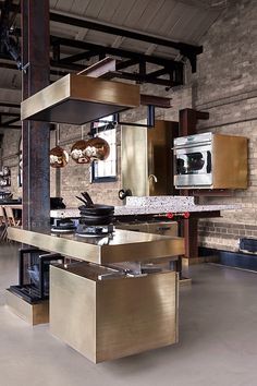
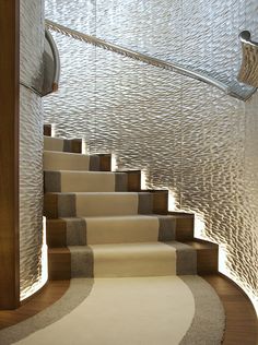
Why not revamp your workplace incorporating a touch of ‘Cherished Gold’. This colour is still bright enough to attract attention while also subtly referring to the past. Having over the years lost its pretentious stigma, it is timeless, warm and adds luxury and class to any room.
Cherished Gold also works wonderfully with many other colour tones, for example, Blues; Duck Egg, Ocean, Browns; Almond, Mink, Black, White.
Gold tones are being heavily used in the design world. It is a recurring colour at most design fairs, in architecture, fashion, beauty and all interior decorating.
Following a similar pattern from last year which saw ‘coppery orange’ featured as colour of the year we are delighted as the two colours merge perfectly meaning the change is not too drastic.
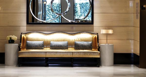
Waiting Area as seen at LuxDeco
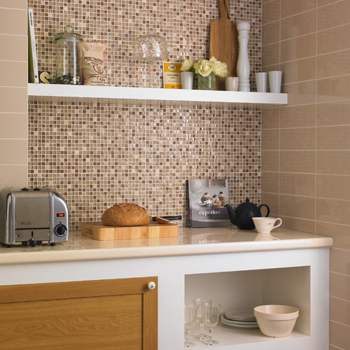
Tea Point Tiles as seen at Topps tiles
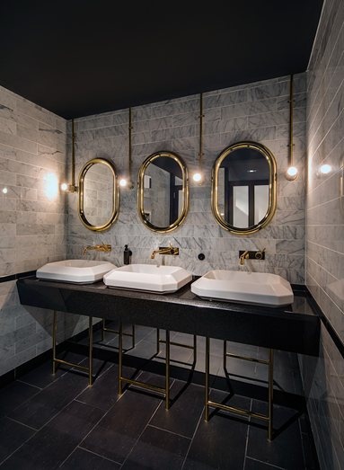
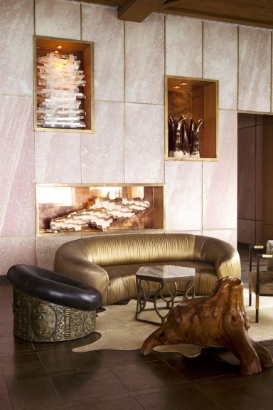
Ideas found on Pinterest
